← All work

Answering “where's my order?” before customers ask.

Redesigning Zid's customer tracking page, mobile-first, so shoppers understand where their shipment is in seconds and trust what happens next.

Role Product DesignerCompany Zid · E-commerce SaaSDuration 1 monthPlatform Responsive web · mobile-first · AR/EN
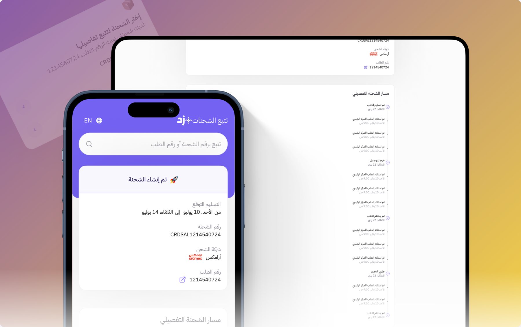
Zid shipment tracking page on mobile and desktop, showing shipment status, expected delivery and the detailed shipment journey
Outcome at a glance

What changed after launch

Fewer inquiriesCustomer questions about shipment status went down.
More visitsVisits to the tracking page went up.
Higher satisfactionCustomer satisfaction with the page rose.
Mobile engagementEngagement from mobile traffic increased significantly.
Finally, I can see exactly where my shipment is, even on my phone!Customer feedback
The new interface is so comfortable and doesn't stress me out while browsing.Customer feedback
01 — The problem

A critical page that caused stress

The tracking page is one of the most important touchpoints after a purchase: it's where customers check on their shipment. But the old version frustrated them. Customers complained about unclear details, a visually straining design, and information that was hard to follow.

On top of that, the page wasn't mobile-responsive, even though most customers check their orders from their phones.

The question became: how do we turn the tracking page into an experience that builds trust and comfort, especially on mobile?

02 — What we found

Four challenges

Unclear detailsCustomers struggled to understand their status. The journey didn't explain what had happened and what was next.
Visually straining designColors and layout were hard on the eyes, and scattered elements made the page hard to navigate.
No information hierarchyThe most important updates were buried among less relevant details.
Not built for mobileKey information was poorly displayed or hard to reach on smaller screens.
03 — The approach

Customer at the center. Mobile first.

We put the customer at the center of the redesign and adopted a mobile-first approach, so the new page would be fully responsive and work well on every device.

A tracking page isn't a report. It's a promise that someone knows where your order is.
04 — Design decisions

Status first, journey second

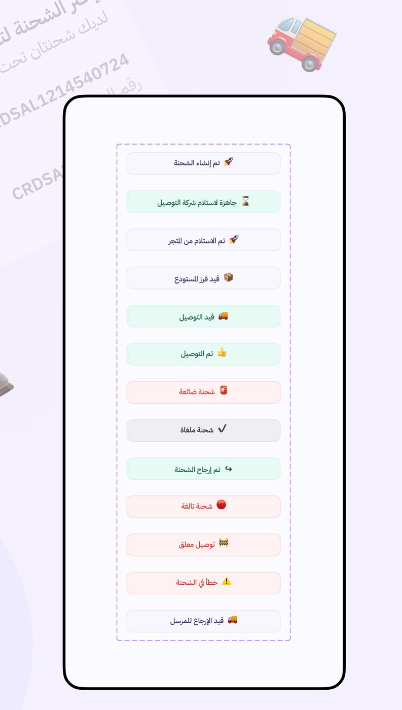
  1. Status front and centerThe shipment status leads the page, with an icon and color code that convey its state instantly, from created and in transit to delivered, returned or delayed.
  2. Clearer UX writing for every statusRewriting the status labels had a significant impact on understanding and accessibility.
  3. A calmer visual designA soothing palette, consistent typography and enough white space for easy reading.
  4. A timeline of the journeyThe shipment's path from start to finish, so customers understand where it is within seconds.
  5. Optimized for touchReadable text, easy-to-tap buttons and fast loading for customers on their phones.
Thirteen shipment status labels in Arabic, each with an icon and color: created, ready for pickup, picked up, sorting, out for delivery, delivered, lost, cancelled, returned, damaged, on hold, error, returning to sender
05 — The final experience

One clear page, on every screen

Search by shipment or order number, see the status and expected delivery at a glance, then follow the detailed journey. The page also handles the moments that usually cause confusion: a clear message when no shipment matches, and a choice when one order has more than one shipment.
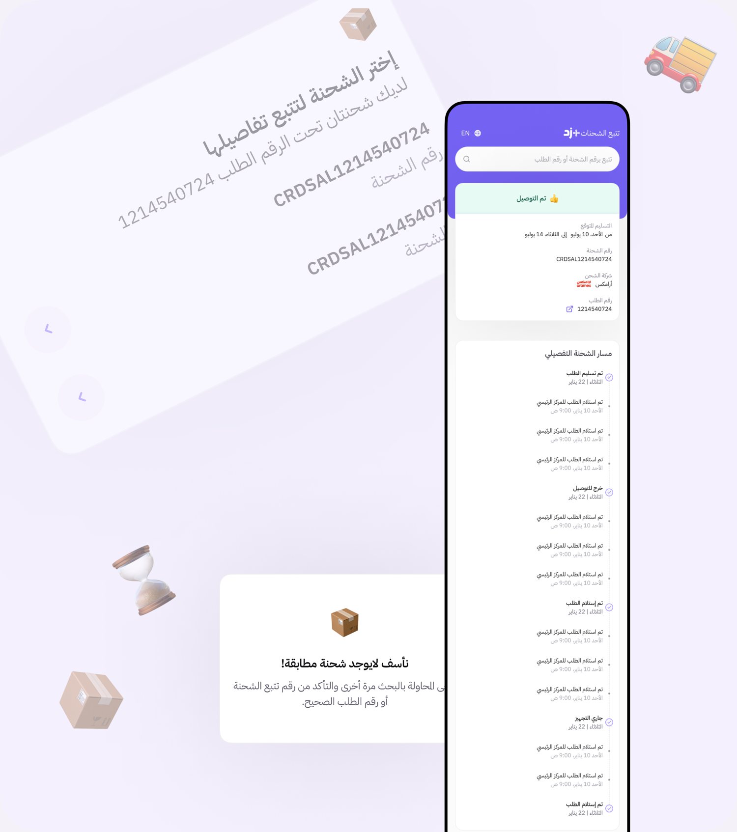
Mobile tracking page with delivered status and detailed journey, plus a no matching shipment state
Delivered status, the detailed journey, and the no-match state
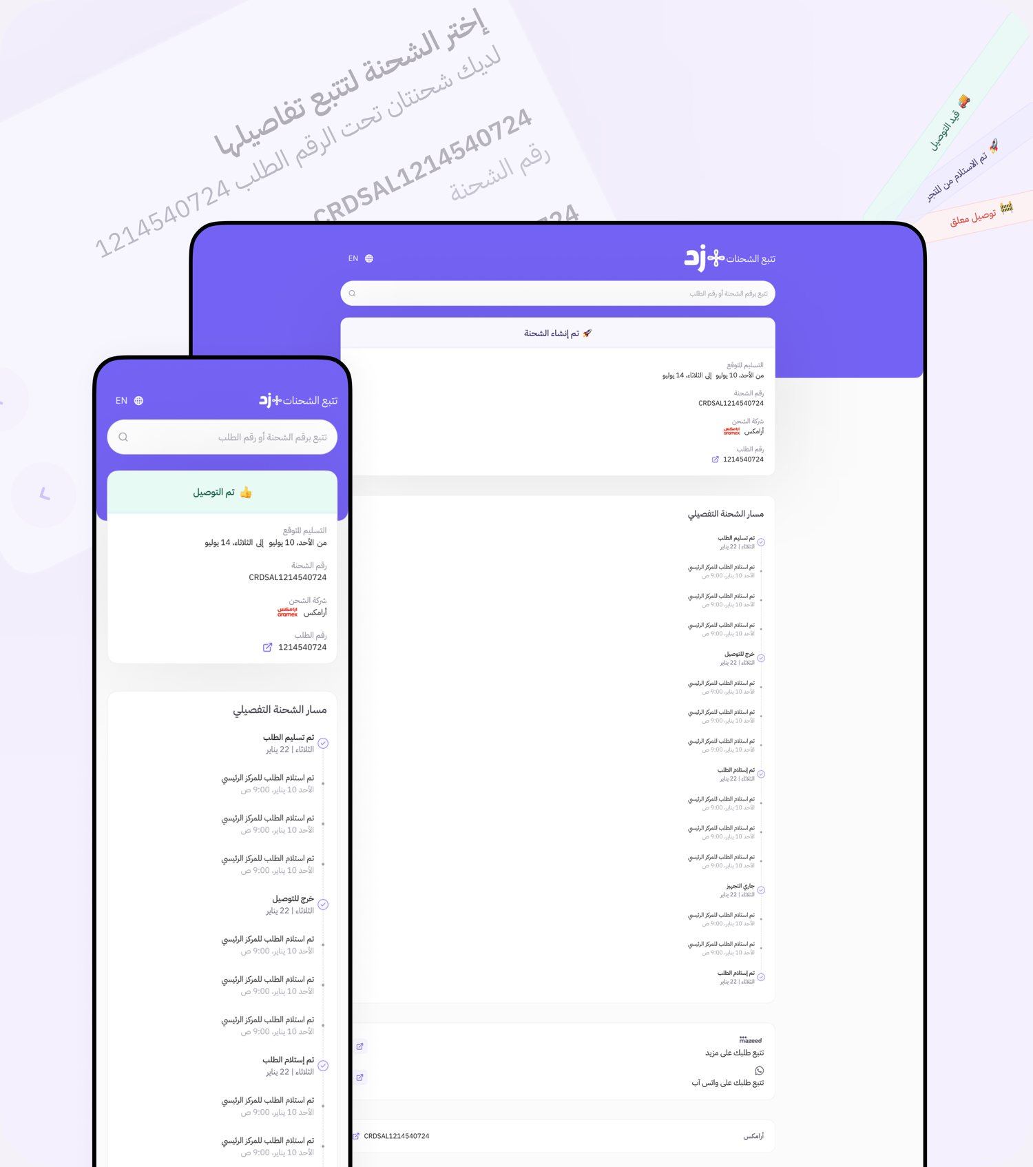
The tracking page on mobile and desktop
Mobile-first, fully responsive on desktop
06 — What I took away

Design is the whole experience

Next

Want results like these?

Work with Reem