← All work

Turning store data into daily decisions.

Bringing analytics into the Zid merchant app, so merchants could check how their store is doing in seconds, on the go, without opening the web dashboard.

Role Product Designer, Zid AppCompany Zid · E-commerce SaaSDuration 2 monthsPlatform iOS & Android · EN/AR
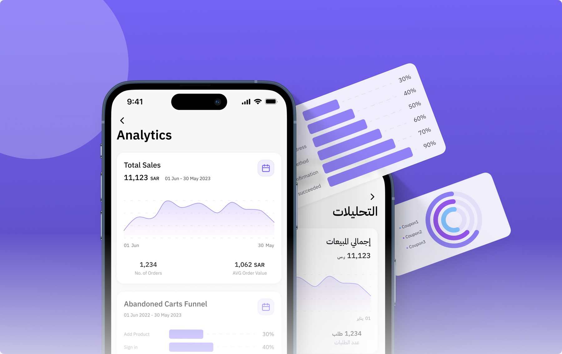
Zid app Analytics screen in English and Arabic, with total sales, abandoned carts funnel and coupon charts
Outcome at a glance

What changed for merchants

Anytime, anywhereMerchants tracked performance from their phone, with no need to open the web platform.
Faster decisionsDaily updates helped merchants respond to trends and adjust operations quickly.
Praised by merchantsFeedback highlighted its simplicity, and the time and convenience it saved.
01 — The problem

The data existed. Just not where merchants were.

The Zid app had no in-app analytics. To see how their store was doing, merchants had to go to the web platform, which was inconvenient for people running a business from their phone. Many asked for quick, daily insights they could check on the go.

The second challenge was harder: there was a lot of data available, and showing all of it would help no one. The real question was which metrics matter most, every day.

My mission: design an in-app analytics experience that gives merchants simple, mobile-friendly access to their business performance.

02 — Research

Going straight to the source

The goal was tied to the app's broader purpose: helping merchants monitor their daily operations efficiently, so they can track, analyze and act on what matters. To find the real pain points, I used four inputs:

Merchant interviewsTo understand their challenges and which data was truly useful to them.
Web analytics usageTo find the most-used metrics and patterns that could shape the mobile experience.
Success team interviewsTo learn what merchants need to track daily to manage their stores well.
Competitive benchmarkingTo see how other platforms make mobile analytics clear and actionable.
03 — What we learned

Most merchants aren't data experts

Sales & ordersCustomer activityAbandoned cartsTop-selling productsMost-used coupons

The value wasn't more data. It was the right data, in the right format, at a glance.

04 — The solution

A daily performance overview

I explored several iterations focused on a clear information hierarchy, a summary of the most important numbers, and visuals that make key metrics stand out.
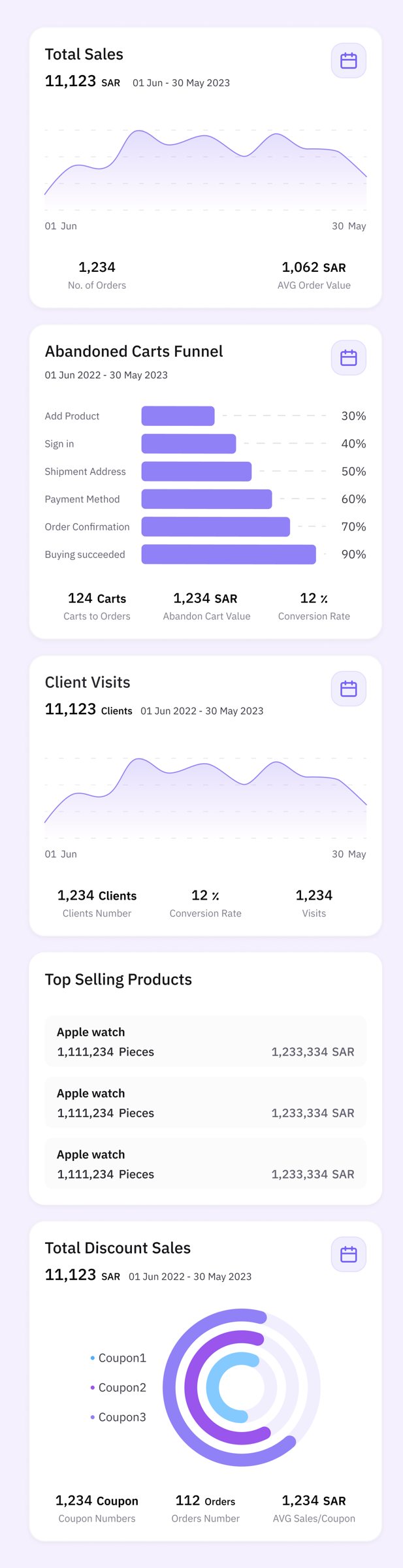
  1. Daily performance overviewSales, orders, customer activity, abandoned carts, top-selling products and most-used coupons, at a glance on one Analytics page.
  2. Summary of the numbers that matterTotal sales, orders and other key indicators surfaced first, in a simple, easy-to-digest format.
  3. Visual insightsCharts show sales and order trends, so patterns are easy to spot.
  4. Real-time updatesData updated in real time, so merchants always see current numbers.
  5. Built for mobile routinesIntuitive navigation and clear visuals for merchants' fast-paced days.
Analytics cards: total sales, abandoned carts funnel, client visits, top selling products and total discount sales
05 — Every state designed

Beyond the happy path

The dashboard came with the states merchants actually run into: a clear message when there is no data for the selected period, a friendly error state, and a date filter to change the period.
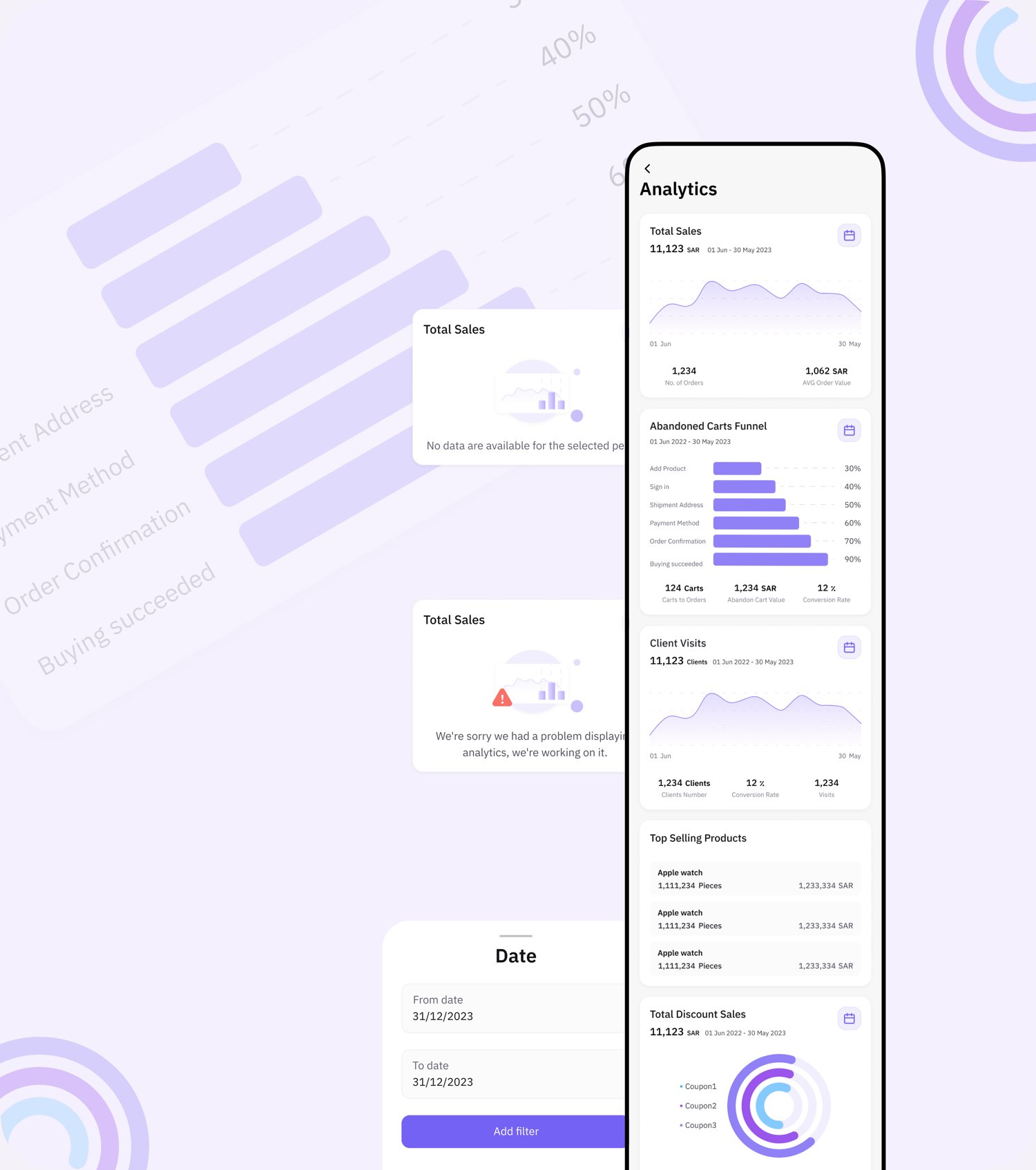
Analytics screen with no-data state, error state and date filter sheet
No-data and error states, plus a date filter for any period
06 — Iterating

Tested with merchants, again and again

The design wasn't static. I tested the feature with merchants multiple times, and each round of feedback shaped the next iteration, making it more intuitive, functional and useful.

Next phase: trend-based suggestions to help merchants understand how to act on what they see, and deeper analytics for advanced users, while keeping the interface simple for everyone else.

07 — What I took away

Clarity over complexity

Next

Want results like these?

Work with Reem